

In the dynamic world of digital marketing, a Call-to-Action (CTA) is more than just a button or line of text. As a compelling directive, the CTA emphasizes your marketing messages and guides website visitors toward a desired action.
The CTA is the magical ingredient that can significantly enhance your website’s performance. A good CTA transforms your website into an interactive space. It motivates customers to actively engage and go beyond mere browsing.
The Power of CTAs
Calls to action (CTAs) possess significant influence in engaging visitors and compelling them to take action. For a seamless user experience, use CTAs to guide your audience through your website.
A CTA stimulates visitors to interact with your content. Types of interactions include:
- Subscribing to a newsletter
- Downloading a guide
- Making a purchase
- Filling out a form
Every CTA is a powerful opportunity to increase conversions and strengthen your business’s bottom line.
CTAs go beyond just engagement. They play a vital role in guiding your visitors. A clear and immediate call to action does not leave visitors guessing. It leads them into the next step of your sales funnel.
Strategic use of CTAs can lead to increased sign-ups, purchases, downloads, and other forms of engagement. These are the actions that positively impact your business’s bottom line. In essence, the connection between CTAs and increased conversions is direct and profound.
Types of CTAs
There are many types of CTAs. Each serves a distinct purpose and fits into different stages of the customer journey.
1. Lead Generation CTAs
Usually utilized on blog posts or other content-rich pages, these CTAs collect visitor information for future marketing initiatives. Good lead generation CTAs give away a free resource, like a PDF or a webinar, in return for an email address.

2. Form Submission CTAs:
Typically located on contact pages or below forms, these CTAs prompt visitors to submit the form. They play a vital role in collecting visitor information, scheduling appointments, or processing orders.
3. Product or Service Discovery CTAs: These CTAs help visitors explore your products or services. You can use them on homepages, product pages, or anywhere you want to direct traffic to your offerings.

4. Social Sharing CTAs:
Used in blog posts or other content, these prompts encourage visitors to share your content on their social media. When used effectively, these CTAs broaden your reach and enhance your visibility.

5. Sales Closure CTAs:
These CTAs drive conversions. They appear on product pages and shopping carts, urging visitors to ‘Add to Cart’, ‘Checkout Now’, or ‘Complete Purchase’.
6. Event Promotion CTAs:
These CTAs are for webinars, live sessions, or offline events. They prompt visitors to register, buy tickets, or save the event to their calendars.

Each type of call-to-action (CTA) serves a distinct purpose in your website’s conversion pathway. The goal is to match the right CTA with the situation, based on the visitor’s buying stage and the desired action.
Designing Effective CTAs
Creating an impactful Call-to-Action (CTA) design necessitates a comprehensive grasp of aesthetics and psychology. It thoughtfully incorporates key elements to form a compelling and persuasive directive.
A good CTA leads and motivates users to act by using attractive design, engaging language, and strategic placement.
Key Elements of a Successful CTA
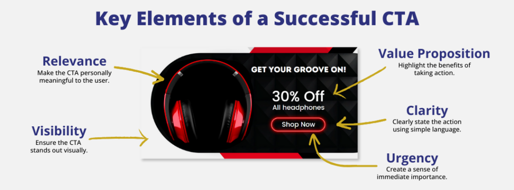
- Clarity: Your call-to-action (CTA) should communicate the desired action, avoiding any confusion or ambiguity.
- Urgency: Creating a sense of urgency can motivate your audience to act promptly. Examples of urgency include limited-time offers, and phrases like “Act Now,” and “Hurry.”
- Value Proposition: Your CTA should convey the benefits associated with taking the desired action. Consider what the visitor will gain from clicking the button or filling out the form.
- Visibility: Ensure that the CTA is easily noticeable on the page. Cluttered layouts can reduce your CTA’s effectiveness.
- Relevance: The CTA should align with the page content and the visitor’s stage in the buying process.
Importance of Color, Shape, Position, and Text in CTAs
Design elements like color, shape, position, and text, capture the audience’s attention. These elements collaborate seamlessly to produce a visually attractive and captivating user experience.
- Color: Ensure that the color of your CTA button stands out from the background color of your page. Warm colors like red or orange can create a sense of urgency, while cool colors like blue or green can convey trust and calm.
- Shape: Rounded corners on buttons are generally more visually appealing than sharp edges. However, make sure that the overall shape aligns with your brand’s visual style.
- Position: Place the CTA in a highly visible area of your page, preferably above the fold. However, the appropriate position can also depend on the complexity of your offering. For complex products or services, a lower position, after providing detailed information, might be more effective.
- Text: Craft action-oriented CTA text that generates a sense of urgency. Keep it concise, clear, and persuasive. Using first-person language often works well (e.g., ‘Start My Free Trial’ instead of ‘Start Your Free Trial’).
By implementing these principles in your CTA design, you can boost your website conversions.
With a strategic and well-executed CTA, you can capture the attention of your audience. You encourage them to take action, and ultimately drive more conversions for your business.
Case Studies: Real-Life Examples of Successful CTAs
Let’s explore some real-life examples of successful CTAs and delve into what we can learn from them. These examples show us what worked well and inspire us to use them in our strategies.
1. Dropbox
CTA: Sign up for free

Dropbox uses a simple yet powerful call-to-action (CTA) on its homepage: “Sign up for free.”
This CTA has been highly effective in attracting new users. It clearly communicates the immediate action, highlights the value of being free, and captures visitors’ attention. It motivates them to act without any obstacles.
As a result, Dropbox has gained a significant number of new users. These users appreciate the straightforward and hassle-free onboarding process. According to a citation from Backlinko, they have seen an impressive 8.18% increase in new users from 2022 to 2023.
2. Netflix
CTA: Try 30 Days Free
Netflix leverages the principle of a free trial in their CTA by stating, “Try 30 Days Free.” This CTA speaks directly to the user’s self-interest and removes the risk associated with a new subscription. The visual contrast between the CTA’s red button and the black background further enhances visibility and attracts immediate attention.
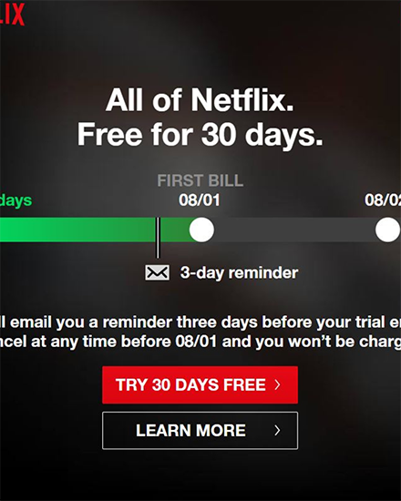
Additionally, according to a report from Statista (https://www.statista.com/statistics/250934/quarterly-number-of-netflix-streaming-subscribers-worldwide/), Netflix has experienced a remarkable 10% increase in new subscribers from 2022 to 2023.
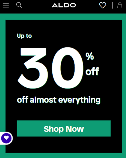
3. Aldo
CTA: Shop Now
Aldo’s homepage features a bold “Shop Now” button, which catches the eye against the background. The CTA is straightforward, easy to understand, and directs the user to the next step.
The use of a contrasting color makes the CTA button visually striking, boosting the likelihood of user clicks. By updating the user experience, Aldo has increased sales year after year. They saw a 5% increase from 2022 to 2023 (source: https://work.co/clients/aldo/).
These real-life examples of CTAs are concise, compelling, and prompt users to take action. A well-designed CTA includes persuasive language, highlights the value proposition, and stands out visually on the page. These elements play a pivotal role in stimulating user engagement and driving conversions.
CTA Best Practices: Dos and Don’ts
When creating your CTAs, keep these best practices in mind. They will help make your CTAs more effective in driving user engagement and conversions. Here are some key dos and don’ts to consider to ensure your CTAs are as compelling as possible:
Dos:
- Test Regularly: Conduct A/B testing of various CTA elements like color, size, text, and placement. This testing will help you figure out what works best for your specific audience.
- Use Actionable Language: Use verbs like Discover, Learn, Start, and Get to guide your audience.
- Make it About the User:
- When crafting your CTA text, consider using the first person like ‘Get My Free Ebook’ instead of ‘Get Your Free Ebook.’ This can help improve click-through rates.
Don’ts:
- Avoid Overwhelming with Options:
- Having too many Call-to-Action (CTA) buttons on a page can be confusing for visitors and weaken the impact of your main CTA.
- Steer Clear of Generic Text:
- Skip the dull phrases like ‘Click Here.’ Instead, craft captivating, distinctive, and relevant text that aligns with your offering.
- Make the CTA Stand Out:
- Ensure that your CTA stands with vibrant colors, size, and position. Make it easily visible without the need for scrolling.
Common Mistakes to Avoid
Creating effective CTAs is more of an art than a science. Avoiding these pitfalls can give your CTAs a boost:
- Lack of Clarity: If your CTA is unclear or confusing, people won’t know what you want them to do. Make sure your CTA tells them what action to take.
- Lack of Urgency: If there’s no reason to act now, potential customers might put it off and forget about it. Create a sense of urgency to get them to act right away.
- Making the CTA Hard to Find: If people have to search for your CTA, they’ll probably give up. Make it stand out and easy to find.
By following these best practices and avoiding common mistakes, you can create winning CTAs. In turn, your website will engage users, increase conversions, and contribute to your website’s success.
Conclusion
In the world of digital marketing, CTAs are super powerful tools that can boost your website’s performance. They’re like these signs that show your visitors where to go and what to do to help your business.
Good CTAs encourage visitors to stay on your site, visit more pages, and make a purchase. A well-designed CTA turns a window shopper into a customer.
Ready to take your CTAs to the next level? Check Off Your List can help you optimize your website’s call to action strategy. Boost conversions, engage your audience, and drive more revenue with our expert guidance. Don’t miss out on potential leads – start maximizing the power of your CTAs today.
Set up a consultation call now.