
Picture this: a potential customer visits your website, only to leave five seconds later because they can’t figure out where to click. Ouch, right? A user-friendly website isn’t just a nice-to-have; it’s essential for keeping visitors engaged, driving conversions, and, dare I say, staying relevant.
This guide is here to help small business owners like you create websites your users will adore—not abandon. We’ll cover everything from design basics to sneaky tech tricks, even dipping our toes into ADA compliance (because inclusivity is always a good look).
By the time you hit the last word, you’ll have actionable steps to make your website not only functional but also fantastic. Let’s get started!
Why User-Friendliness Matters
A user-friendly website is like a welcoming storefront. If it’s clean, clear, and easy to navigate, customers are more likely to stick around. But if it’s cluttered, confusing, or—in the worst-case scenario—inaccessible, they’ll take their clicks elsewhere.
Some cold, hard facts to illustrate the stakes:
- 88% of online consumers are less likely to return to a website after a poor user experience (UX).
- Businesses lose almost $2.6 billion annually due to bad website UX.
- Websites that are accessible and user-friendly boost customer satisfaction, sales, and even SEO rankings.
Are you ready to join the user-friendly website elite? Read on.
Step 1: Start with User-Centric Design
Your website should focus on what your users actually want—not what you think looks cool. (I’m looking at you, flashing buttons and autoplay videos.)
Simplify Navigation
Navigation menus are your website’s map. If the map’s confusing, your customers will get lost and leave. Keep it simple and intuitive:
- Stick to familiar categories like “Home,” “About,” and “Contact.”
- Limit navigation items to 5-7 to avoid overwhelming users.
- Include a search bar for customers in a hurry.
Example: Check out Amazon’s header menu. It’s clean, categorized, and includes a prominent search bar right at the top. Oh, and it doesn’t make you click through 17 submenus just to find “Shoes.”
Optimize for Visual Appeal
You don’t have to be a professional designer, but your site shouldn’t look like it was coded in 1999 either. Use:
- A consistent color scheme that reflects your branding.
- High-quality images (no pixelated product photos, please).
- Plenty of white space to keep pages uncluttered.
Pro tip: Test your site’s design on both desktop and mobile. About 55% of web traffic now comes from mobile, so make sure it’s working as smoothly as your desktop site.
Step 2: Make Loading Times Lightning Fast
Nobody wants to wait 10 seconds for your pages to load. Studies show that after just 3 seconds, most users will abandon your site. (Yes, people have the patience of toddlers these days.)
Speed Fixes to Boost Performance
- Compress images to reduce file sizes.
- Use caching tools to help load previously visited pages faster.
- Choose a robust hosting service that can handle your site traffic.
- Reduce unnecessary plugins if you’re using platforms like WordPress.
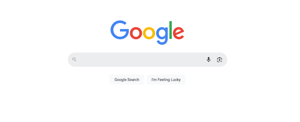
Example: Take a page out of Google’s playbook—literally. Their homepage is minimalist, fast, and to the point. You’re not left guessing where to click or twiddling your thumbs as it loads.
Step 3: Incorporate Clear Call-to-Actions (CTAs)
CTAs are like arrows that direct your visitors where to go. Want them to sign up for your newsletter? Buy your product? Make it obvious!
CTA Pro Tips
- Use action-driven phrases like “Get Started,” “Shop Now,” or “Book Your Free Consult.”
- Make your buttons big, bold, and easy to see—contrast them against your background.
- Place CTAs prominently on your homepage and key landing pages.
Example: Netflix nails this with their “Get Started” button. It’s the first thing you see on their homepage, and it leaves no room for confusion.

Step 4: Make Your Website ADA Compliant
Accessibility isn’t just the right thing to do; it’s legally required. ADA compliance ensures your website can be used by people with disabilities.
Steps to Improve Accessibility
- Add alt text to all images so screen readers can describe them to visually impaired users.
- Use headings (H1, H2, H3) to structure your content for easier navigation.
- Caption all videos for users with hearing impairments.
- Ensure your site works well with keyboard navigation (not just mouse clicks).
Tools to Test Accessibility: Websites like WAVE and WebAIM offer free resources to check your ADA compliance.
Example: Target revamped their entire website to meet ADA standards. The payoff? A more inclusive experience for all users and enhanced public goodwill.
Step 5: Test, Tweak, Repeat
No website is perfect—at least, not on day one. Regularly audit your site and make improvements as needed.
How to Test Effectively
- Use heat maps and tools like Crazy Egg to see where users click.
- Track bounce rates in Google Analytics to identify weak points.
- Ask real people (not just your team) to test usability and give feedback.
Final Reminder: Your website is a living, breathing part of your business. Treat it accordingly.
Small Changes, Big Impact
Making your website user-friendly doesn’t have to be rocket science (or cost you a fortune). By focusing on intuitive design, fast functionality, and meaningful accessibility, you’ll see happier visitors—and higher conversions.
If you’re feeling overwhelmed, reach out to professional web designers or developers (hi, that’s us!). They can help with ADA compliance, custom design tweaks, or full-scale website overhauls.
You’ve got this! And if you need help, you know where to find us.